Are you skeptical about the use of design for growing your business? Often, people think of design simply as making a website look good, but can it improve the way it functions from a business standpoint?
Our answer is yes. In one case, we doubled a number of auto-pay sign ups by improving the page design only.
Our client operates a local business where most business revenue is derived from a monthly subscription service. We found that customers who are on the auto-pay subscription are much less likely to cancel their service because their credit card is automatically billed every month. Increasing the number of these auto-pay customers was a natural next step to our work with them.
We gathered baseline data for the average number of new weekly sign ups and how long it takes customers to make a payment. We also checked a percentage of customers who enrolled in the auto-pay service.
On the administrative side, we researched the current process of the business office staff as a new customer was acquired with regular and auto-pay methods. When customers do not sign up for auto-pay, it takes a lot more for the business to process customer invoices especially in a case of paper invoices and check payments via mail.
As part of the market analysis, we reviewed the signup process for competitors and discovered that their processes were much more complicated and less user friendly, giving our client yet another way to stand out in the marketplace by improving the customer experience. Unlike some competitors, we didn’t want our client to have an immediate credit card payment to sign up for services because understandably, many customers have issues giving an immediate credit card payment to a business they haven’t yet established trust with.
So how could we improve the auto-pay conversion rate but not require prospects to enter credit card information? This is where our innovative page design approach helped us.
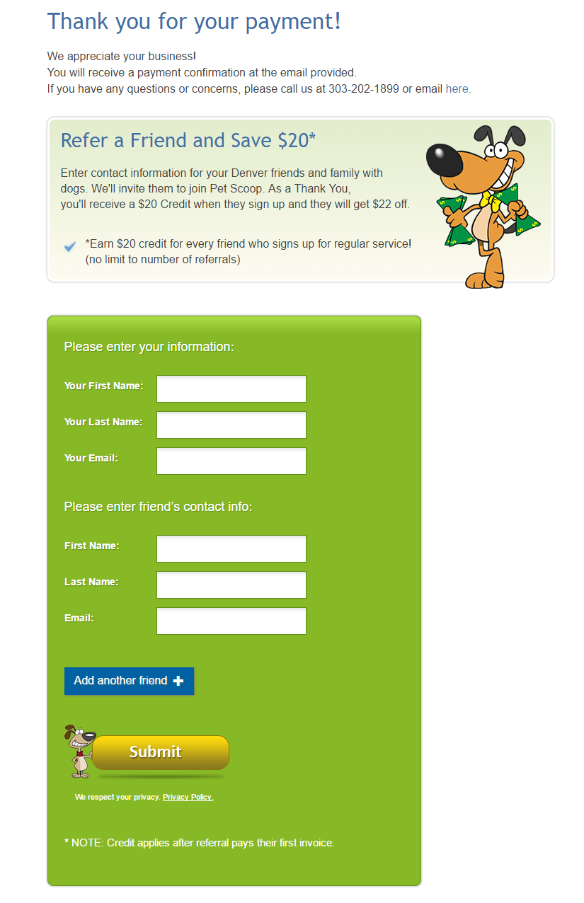
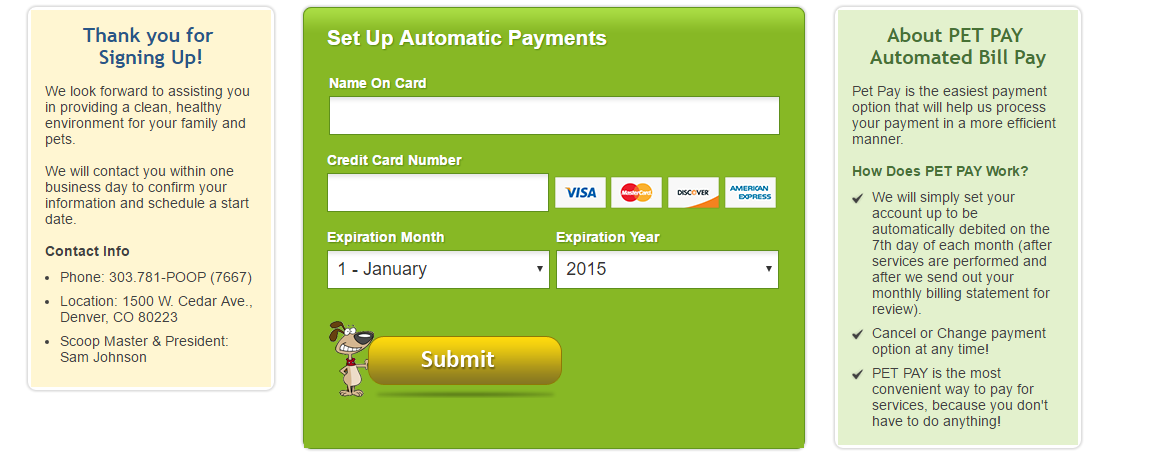
We confirmed our initial prediction that after the initial service sign up form, the middle section (payment section) of the page would draw visitors eyes with the green background color. And if new customers did not want to provide their credit card information initially, they would notice the message “Thank You for Signing Up!” after taking another look at the page.
It’s important to note that we did not arrive to the final winning design at first. It took three iterations and testing periods to come up with the winning design that doubled the website conversion rate. To confirm what page layout worked the best, we used Google experiments to do A/B testing.
BLOG COMMENTS POWERED BY DISQUS